furl
Getting startedDesignComponents
Design
Design GuidelinesTypography SystemLayout SystemColor palettesCustomization
Components
ComponentsAccordionAlertAnchorAudioAvatarBadgeBreadcrumbsButtonButtonGroupCalendarCardCollapseContextButtonDividerDropdownFooterFormGraphGridHyperlinkIconIframeImageInputItemLayoutListLoaderMediaObjectMenuModalNotificationPaginationPopoverProgressSearchStepsSwitchTableTabsTooltipTypographyVideo

Design Guidelines

furl’s designs are handcrafted based on modern design techniques and practices, catering to all the needs of a modern application’s UI/UX. All of the components follow the same guidelines, such as the same size, spacing and typography system presets and the same color palettes to add a sense of consistency to your application.
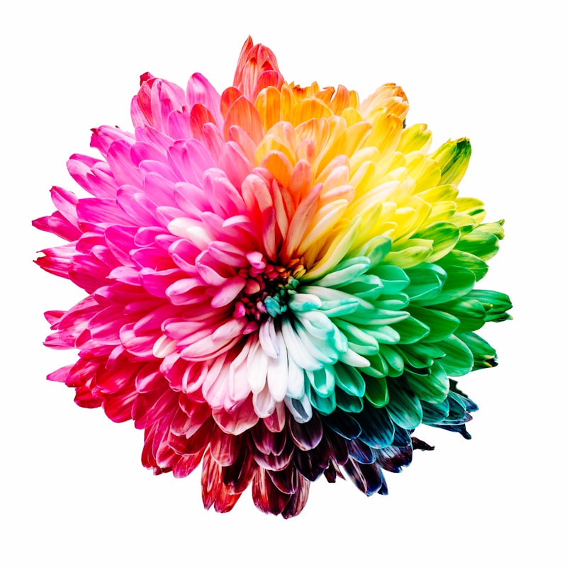
Photo by Sharon Pittaway on Unsplash

Most of the design systems are customizable at their core (e.g. changing the size scale or default fonts), while components can also be fine-tuned and extended to suit your specific needs.

furl was designed and developed by Angelos Chalaris © 2019
Documentation generated using Gatsby, hosting by Netlify